[Feedback] A few UI/UX Issues
There's quite a few UI/UX issues that I've noticed with the game so far:
- When purchasing weapons and masks through the Loadout menu, you get redirected to the Vendor tab, but there's no way to navigate back to the previously visited menu.
- Challenges, and loot/cash obtained within the heist should be visible within the TAB menu.
- No hostage count.
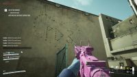
- No ammo outlines
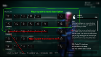
- Skill tree UI could use some categorization here. At the moment it looks the Perk Deck interface, and having it categorized into 'roles' like in Payday 2 would definitely help.
- It seems you have a 'soft' armor that will let you tank hits before your actual armor starts depleting, but it's not indicated anywhere..
- Having to sync with the server every time you purchase any items can get quite irritating.
- Holding the Mark button opens the Communication Radial here. Which means I can't rebind the key to the old Payday 2 interact/mark button without opening the radial menu every time I interact with objects.
Comments: 28
-
02 Aug, '23
slyceth MergedWhen I research a skill, the text changes to researching instead of research, I believe this might not be enough for the visually impaired. Making a little graphic or changing a color or highlight behind this researching text will help it be more obvious.
-
02 Aug, '23
Mistrum MergedSkills page items should not select on hover. This disallows ease of scrolling through a skill's description without carefully navigating around all other skills until your mouse is in the description box to scroll (Eg. Engineer). This also essentially forces the use of the key "T" to equip / unequip as mousing towards the button itself auto selects skills on the way to the button.
-
03 Aug, '23
Nick MergedThe main Menu interface lacks many options from payday 2 and is quite chunky. Make the user interface seem new or have the main screen be your personal safe house where you can access different menus and vendors. Reference the safe house from payday 2 and the interface from Phasmaphobia.
-
03 Aug, '23
Pusico MergedA little bit confusing to use the menu with a new interface, like moving from "loadout" to other icons by pressing "z" or "x." Maybe it will be better if the menu "play" will always be as a main menu, and if the player is in the loadout menu by pressing "ESC," the player moves to the main menu.
But additional feedback about emotions after testing the beta. Huge, huge thank you to the developers for giving me a chance to try the game. I played a lot in PD2 and was shocked about the news of PD3. Many unique mechanics, much harder to play, new strategies in the planning stage (before taking on a mask), visual effects so impressive and overall, the game looks so fresh, and I love it even more than before. -
04 Aug, '23
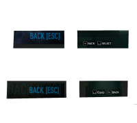
Austin MergedWhen you are customizing weapons and selecting an attachments such as a barrel extension or sight, the "Select" button is on the right, while the "Back" button is on the left. But when you go back, to the weapons screen where you can see each gun you have, "Back" is to the right, while "Equip" is on the far left. I think it would make more sense to have the "Back" button be in the same spot, so you can quickly get to the loadout screen with ease.
-
04 Aug, '23
RiskE80 Mergedthe UI is really hard to look at, way too many black boxes with no separation
-
04 Aug, '23
Snaex Admin"[Feedback] Skills Menu Clunkiness" (suggested by Mistrum on 2023-08-02), including upvotes (1) and comments (0), was merged into this suggestion.
-
04 Aug, '23
Snaex Admin"[Feedback] Menu: Make skills in researching be animated, not just change text to "researching"." (suggested by slyceth on 2023-08-02), including upvotes (26) and comments (0), was merged into this suggestion.
-
04 Aug, '23
Snaex Admin"[Feedback] Main Menu UI" (suggested by Nick on 2023-08-03), including upvotes (1) and comments (0), was merged into this suggestion.
-
04 Aug, '23
Snaex Admin"[Feedback] the menus are way too difficult to look at" (suggested by RiskE80 on 2023-08-04), including upvotes (1) and comments (0), was merged into this suggestion.
-
04 Aug, '23
Snaex Admin"[Feedback] Switching the "Back" and "Select" positions while customizing weapons?" (suggested by Austin on 2023-08-04), including upvotes (1) and comments (0), was merged into this suggestion.
-
04 Aug, '23
Snaex Admin"[Feedback] Menu coordination" (suggested by Pusico on 2023-08-03), including upvotes (1) and comments (0), was merged into this suggestion.
-
04 Aug, '23
Rayan MergedI feel like I'm just being petty but the ESC and Select are inverted like the icons on different pages.
1
For example on the attachments screen its ESC and SELECT but clicking on a specific attachment its SELECT AND ESC.
There are a lot more instances where this can be found.
But I feel like the layout should be "Button" and ESC. That's the best way it could be fixed imo. -
04 Aug, '23
FortyJagsI would also like to point out that the key card colours are difficult to see on the UI. It might not be so bad on a smaller screen but on larger screens I can't see the little colour blib on the key card. Would it maybe be possible to have the entire key card be coloured in to make it more obvious which card you have?
-
05 Aug, '23
Al'ghale- Now that I can see the Challenges are working, viewing the Challenges tab post-game is very slow. You have to wait for all the cleared challenges popping up one by one before you can continue. There should be a way to skip all the animations of cleared Challenges popping up (just like skipping earned exp in Payday 2)
- You should be able to hover over a cleared challenge to see what you had to do for that particular challenge.
- If you take too long securing the loot bags and the objective reverts back to "turn off the bollards", you can still deposit the loot bags in the van but the icon's just not indicated in the map. It should be made visible regardless.
- When attempting to purchase an item you already own, there's no alert message saying that the item has already been purchased before. This is a major human error risk especially because destroying an item does not refund the money back to you unlike in Payday 2. -
05 Aug, '23
callmesydney MergedIn Payday 3, your weapon doesn't have a specific damage or accuracy value. Instead, there is like a loading bar showing you how accurate is your weapon. It's a pretty bad design choice that Overkill already tried with Payday 2 in it's early state which was quickly changed for a way better system. Please, let us know how much damage is needed for a breakpoint or at list give us actual number that we can work with. Same goes for the ammo pickup, please let us see how much ammo my weapon is going to pickup. That's something that was officialy done or modded in PD2 and it is a wonderful tool to understand how and what makes a weapon good or bad.
-
05 Aug, '23
Papa Nurg MergedJust merge Loadout and Vendors, dislike that I have to use the keys/buttons to switch tabs back and forward. If I go to my loadout, want to purchase from their to fill the slots. I should be able to go back in that loadout slots instead of switching tabs. Not sure why there was such a change for that, I.E suits, gloves, mask and weapons. Preferred that it was in the same tab.
We shouldn't have to go through another tab, just to purchase items. We should just have it in the same page, the loadout page. -
06 Aug, '23
Snaex Admin"[Feedback] Icons/Buttons not in same spots when in different menus" (suggested by Rayan on 2023-08-04), including upvotes (1) and comments (0), was merged into this suggestion.
-
06 Aug, '23
Snaex Admin"Menu change Change QoL" (suggested by Papa Nurg on 2023-08-05), including upvotes (1) and comments (0), was merged into this suggestion.
-
06 Aug, '23
Snaex Admin"[Feedback] UI and weapon cusstomization" (suggested by callmesydney on 2023-08-05), including upvotes (1) and comments (0), was merged into this suggestion.
-
06 Aug, '23
Snaex Admin"Press R should modify weapons without having to go into the equip menu" (suggested by Oddisy on 2023-08-05), including upvotes (1) and comments (0), was merged into this suggestion.
-
06 Aug, '23
Snaex Admin"While purchasing a weapon, hitting escape should return to the weapons menu" (suggested by Oddisy on 2023-08-05), including upvotes (1) and comments (0), was merged into this suggestion.
-
06 Aug, '23
Snaex Admin"Escape at main menu should pull up "quit game" option" (suggested by Oddisy on 2023-08-05), including upvotes (1) and comments (0), was merged into this suggestion.
-
09 Sep, '23
Soldier Boy MergedI'm not a fan of the UI layout of the main menu. I was lost on where to go today and felt quite silly when I found what I was looking for. Definitely not a fan of it. It could be a lot simpler and less compacted/compressed or squished up.
-
12 Sep, '23
Snaex Admin"[Feedback] UI FEATURE" (suggested by Soldier Boy on 2023-09-09), including upvotes (1) and comments (0), was merged into this suggestion.
-
24 Sep, '23
Gommald MergedIt would be helpful if skills in the skill tree had visual indicators if they gave/refreshed edge/grit/rush. When needing one of the buffs for a skill, it can be tedious to find all the skills that can give you the buff, and the indication would be very helpful!
-
07 Oct, '23
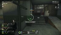
EztarioI would love to see the Devs take inspiration from Payday 2 Hud mods. I've included a reference so you understand what level of detailed information players are looking for. (Also yes, it says "G to interrupt" meaning there is an option to not have to hold the button for mission objectives)
-
12 Oct, '23
Snaex Admin"[Feedback] Visual indication for perks that provide edge/grit/rush" (suggested by Gommald on 2023-09-24), including upvotes (1) and comments (0), was merged into this suggestion.


